~/ BANK FINANCE next case
+++++++ Sparkasse Goes Digital /2019
"Credit per Click" - provides a simple digital credit calculation solution.

- Brand Story: Sparkasse offers consumer credit products, nowadays Customers expect to be able to apply for credit fully online without having to visit a branch. On the current Interface Users struggle to move seamlessly from product discovery to application initiation due to unclear navigation, insufficient guidance, and a lack of coherent screen flow. As a result, users experience cognitive friction, uncertainty about next steps, and reduced confidence in completing the credit process.
- Problem Statement:The current interface is non responsive and not suitable for mobile Use Case. We want to make credit applications more efficient. Offering a digitial solution for our clients. In essence, the problem is not a single visual flaw but a structural UX issue: the screen does not adequately support the user’s decision-making process or clearly connect to subsequent actions within the credit journey.
- Users Journey Needs: Make the credit process clear, transparent, secure, and supported from the first interaction to repayment. communicate steps of the process clearly, we need to visualise clarity and simplicity starting the credit process.
- transparency about costs, rates, and repayment
- trust & security when sharing personal data.
- Users need easy access to support when something is unclear.

Sparkasse Public City Finanzcenter

Sparkasse Brand Logo


Define User Needs and UX Metrics

Sparkasse responsive "Credit per Click" Solution

User Goal: Easy digital Credit Check

PAIN: Task Flow Screen Overload
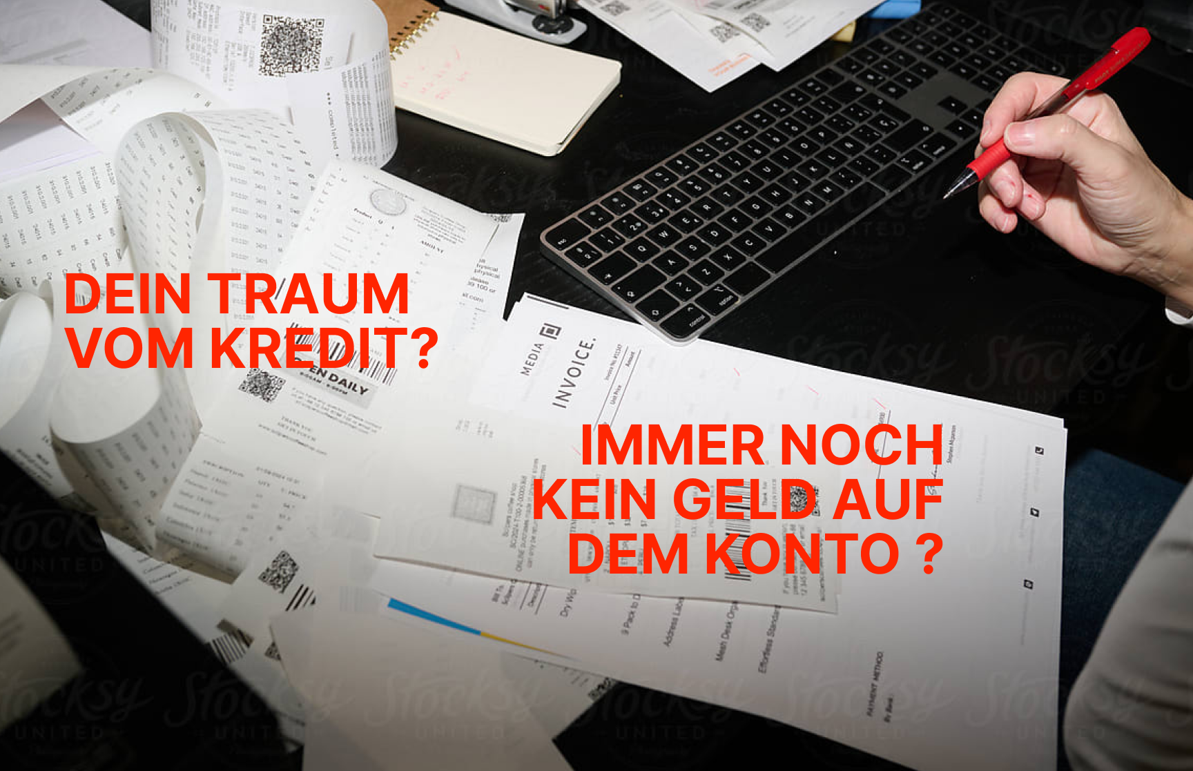
PAIN: paperwork overload

Solution: Easy digital Credit Check
- Reducing Screen Layout Complexity and User Required Infos. The current landingpage gives less clarity about the key benfits or key steps. With the new approach we wanted to improve that. With Design Exploration we draft options, with less or more content infos provided.
- On the Startscreen above the fold, users dont see the credit calculation, nor the full complexity of the input informations required. Its important to figure out which Questions Sparkasse has to answer pominently to guide the User, they can expect first value output eg, answering 01-Credit requirements, 02-Credit modalities
- Mobile First The current Sparkasse credit onboarding journey is not optimized for digital-first customers. Users face unnecessary friction, long forms, and unclear progress indicators, which lead to high abandonment rates and lost revenue opportunities. At the same time, strict compliance requirements are necessary for trust and are currently hidden.
Evaluate Heuristic UX Design Principles to define features for the credit flow

Layout_v1: Startpage Entry Screen (Above the fold no Calculation)

Layout_v2: Startpage On scroll Credit Calculation Layout visually Cluttered (no steps, no help)

Improved: Layout Solution with UX progressive disclossure Step Guidance

Problem: Screen Complexity

Friction: Support Calls

Qualitative Feedback: Time on Task (Homepage, Section, Feature..)


Problem: Screen Complexity
Qualitative Feedback: Time on Task (Homepage, Section, Feature..)

UX Navigation Task break down

Steps requirements break down

Design Behaviour/Results Matrix

Design UX/UI Focus Priorisation

UX improvements: Mobile Touch Friendly

UI Touch friendly Icons
We provide clear visible Steps, Contextual clossure with the flex Card scroll Deck

UX Concept Mobile

UX Concept Desktop

UI Card Slide Deck

UX improvements: Mobile Touch Friendly

OLD: Intro Check
- Easy check - for Applying for credit online should be quick, easy, and worry-free. We make 4 Infos clear: Requirements, Contact, Steps and Credit Calculation .
- 💬 Chat – 📞 Call Get instant answers to your questions directly in the application flow. Our advisors are available to clarify details, explain next steps, or guide you through form fields in real time.
- Touch Friendly - mobile first Design clear visual hierachy and guidance simplifies the onboarding. Conceptual Variations can be implemented for Desktop, Tablet, Mobile Screens.
Simplified Onboarding,
bringing you closer to your secured finances.

Web UI Startpage

Sparkasse Credit USP

Web UI Scrolled

Additional Service

Proof USP: Direct Payout
Ensure compliance (KYC, PSD2, GDPR) Legal Compliance.
- Problem: Loan terms (APR, repayment, total cost) not visible early enough → hesitation. Add a short explainer screen before identification (“Why this is needed, how it works, how your data is secured”).
- Recommendation: Present key terms upfront in a summary box before data entry. Add hover/click info icons for explanations of fees & repayment schedules. Use Sparkasse branding & trust seals (BaFin, TÜV, SSL) to build confidence.
- Provide a real-time calculator showing monthly rate changes as users adjust loan amount/duration. Allow users to choose their preferred identification method (VideoIdent, eID, Bank Ident)


Credit Check: 4 Steps

Onboarding Check: Variation

Onboarding Check: Variation

User Goal: Easy digital Credit Check
The Desktop functionality adapts to Mobile screen sizes, Variations can be tested