~/ SAAS OPENTALK next project
+++++++ UX Audit Analysis
Goal alignment through Stakeholder Workshop and Heuristic Evaluation

- Brand Story: OpenTalk is a modern, secure, European-focused video conferencing solution designed with a strong emphasis on data sovereignty, privacy, and productivity—empowering organizations to collaborate with GDPR confidence and individual data access control.
- Brand Promise: At its core, OpenTalk positions itself not just as “another meeting tool,” but as a product designed for public organizations and educational settings that require control and Digital Sovereignty over their communication and data.
- Problem Statement: The company has already launched a service page and a functional software interface, but is seeking improvements to the dashboard UI. These adjustments require a thorough evaluation from a user experience perspective to identify usability issues to establish a clear, focused user flow.
- Assumptions to Test: We want to test our assumptions, that we think the Interface lacks clarity and additional informations and guidance, Enhancing "how to use tips" for first-time users through tooltips or explainer visuals. as well as more Segmentation of Features for specific institutions and use cases.

Opentalk Logo: Brand Design Experience

Use Case: Customer Enverionment

Brand Value perception

Brand Discovery USP Market Focus

New Work Solution: Video Conference Call

Use Case: Service Slogan

Brand Discovery Stakeholder

Internal and External Stakeholder
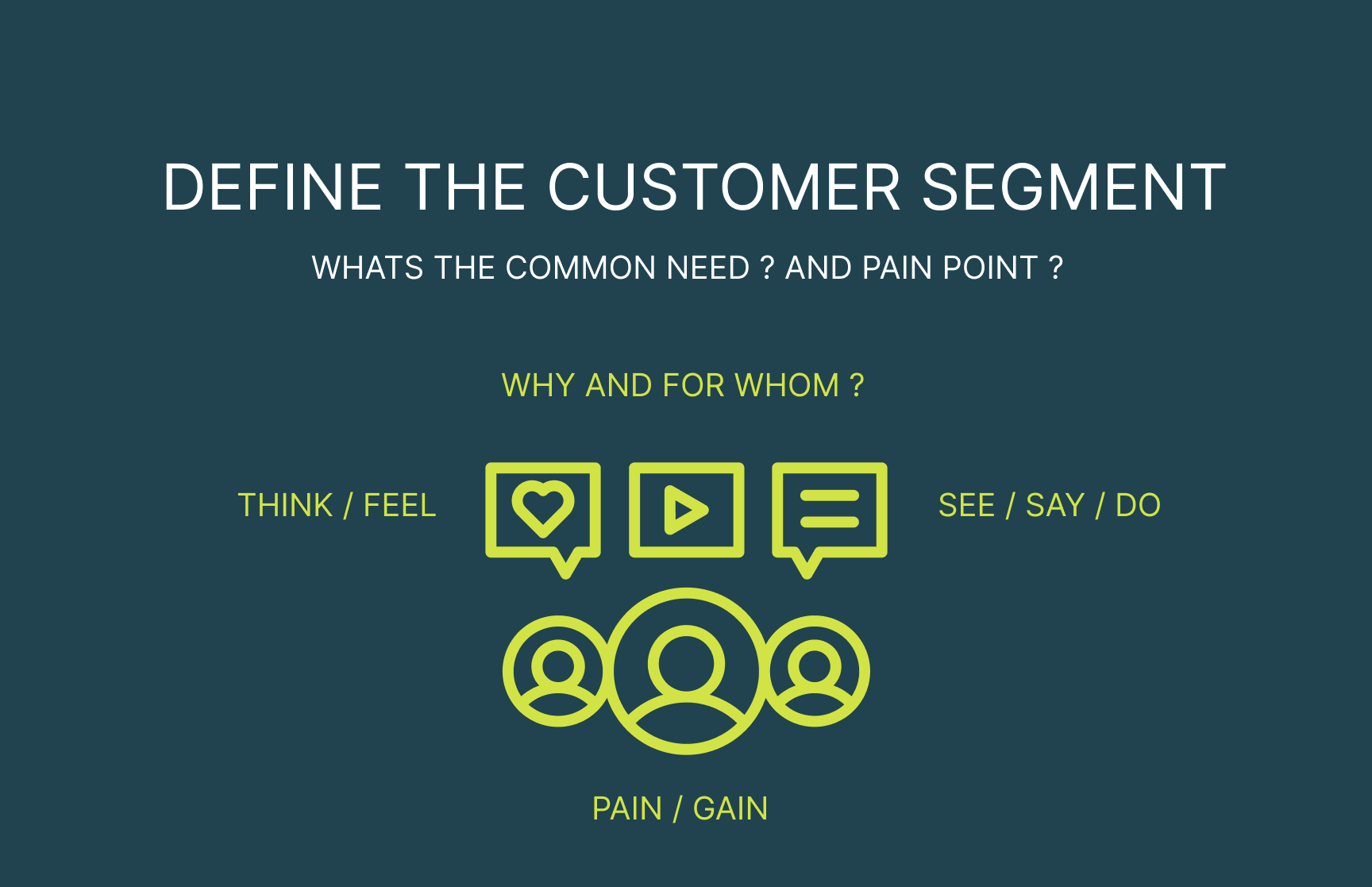
Brand Discovery: Customer Segment

Opentalk USP: Room for more..


Opentalk USP Feature List
 Opentalk USP Feature List

 Service Page: Software Product Intro
Service Page: Price & Feature Options (not all listed)

Service Page NEW Optimised: Business / Privat
 Key Visual Illustration for the Dashboard
New Solution: improved Onboarding

UX Problem: Settings in 3rd depth Navigation
- Solution: We aim to improve user engagement, and de-risk frustrations, showing the price plan Overview and features they can try.
- The Process: It was important to understand the Brand values and Customer segment and deeply Analyse the Navigation System of the Dashboard to make it more intuitive.
- User Satisfaction:Users shall feel a delight without the heavy search locating content informations, or irritating warning error messages.
- Assumptions to Test: Did we improved the expperience? Less overwhelm? more clarity? easy control of settings?
Analysing Friction Points, for an optimised UX Experience
"how to use" the system

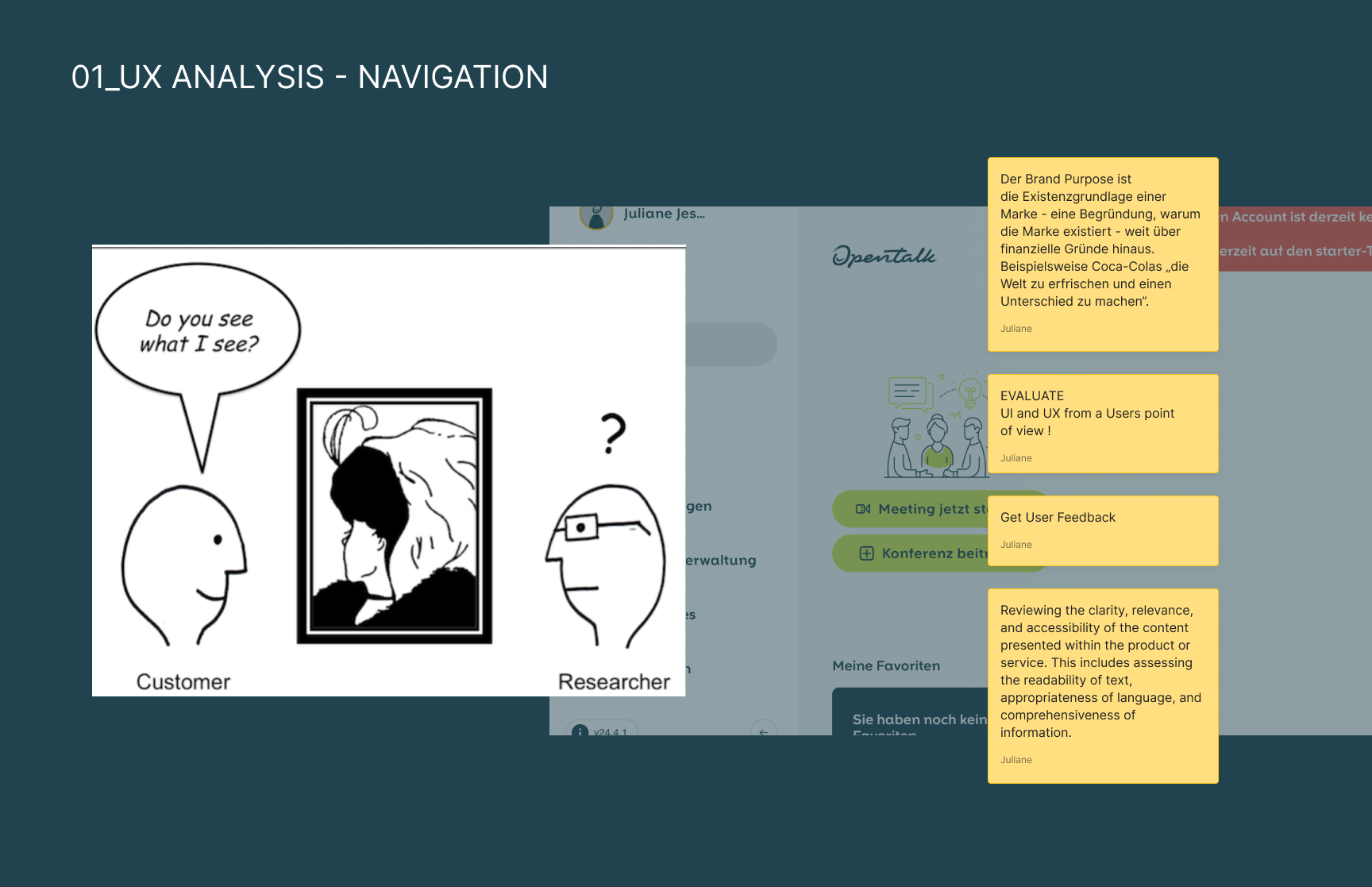




- Usability Questions: What part of the site/app did you find easiest to use? Did you encounter any issues while using our product/service? If so, what were they? How intuitive do you find the navigation on our site/app? Are there any parts of our product/service that you find redundant or unnecessary? Did you need any assistance while using our product/service?
- Task Success: How quickly can you complete a task on our site/app? Where would you assume Package Settings and Feature add Ons? Were there any features you found difficult to locate? How many steps did it take to complete your desired task? Which parts would you improve the usability of our product/service?
- Feature Location:What is my current Plan? Where would you expect the features add Ons to the Plan? Do you need more explanation and guidance about How to Use them in teh Video conference? Are you figured out whats in the FREE Package? Is the free package enough to make use of the Service at all ?
- Assumptions to Test: We think, it is more important to show the Plan of Use, rather than hiding it on a 3rd Layer of Subcontent. We also think it should be more visible, which features are included, or to add on more features for a specific use case: Teacher (Record, Take PDF Notes, Polls), Tech CEO (Polls, Record), Basic User (Record).
Workshop Guidance for specific topics of the Analysis and Heuristic UX Design Evaluation

Dashboard Screen with Error Message

Dashboard UX FLow Concept

Dashboard Meeting List

Dashboard Brainstorming Notes
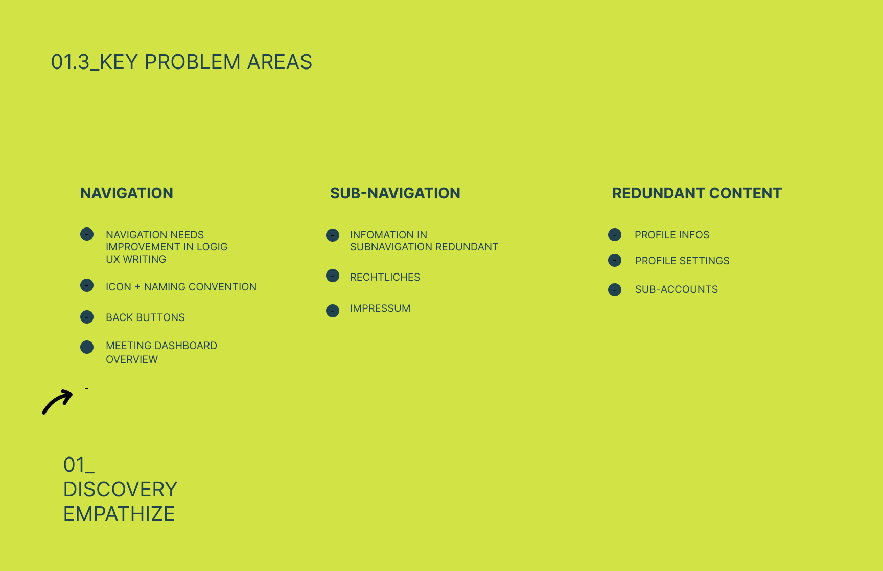
Dashboard Problem Areas
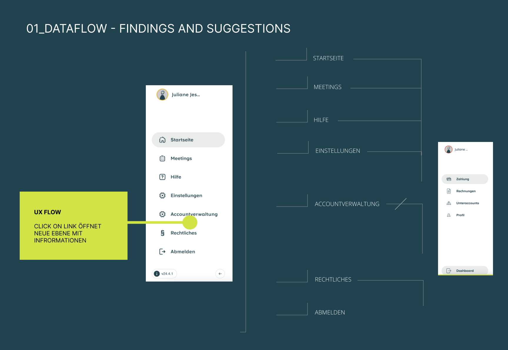
User Flow Logic - redundant Icons, Profile Settings

User Flow Logic - Change Payment Plan

UX Solution: First-Time User Guidance and possible Add Ons


- UI Improvements: Simplifying the dashboard interface to create a clearer, more intuitive experience and make essential actions easier to discover.
- UX Improvements: Reducing complexity and cognitive load by creating a more structured information hierarchy and guiding users through the platform with greater clarity.
- Business Impact: Strengthening OpenTalk’s position as a trusted, sovereign communication platform by making its core features easier to understand, access, and use across different organizations.
- UX Impact: Helping first-time users navigate the dashboard with confidence through contextual guidance, clearer feature segmentation, and interfaces tailored to different institutions and use cases.