~/ SAAS SOFTWARE next case
Incom
studium
[ incom-website ]
www.incom.org
10/2025 - 03/2026


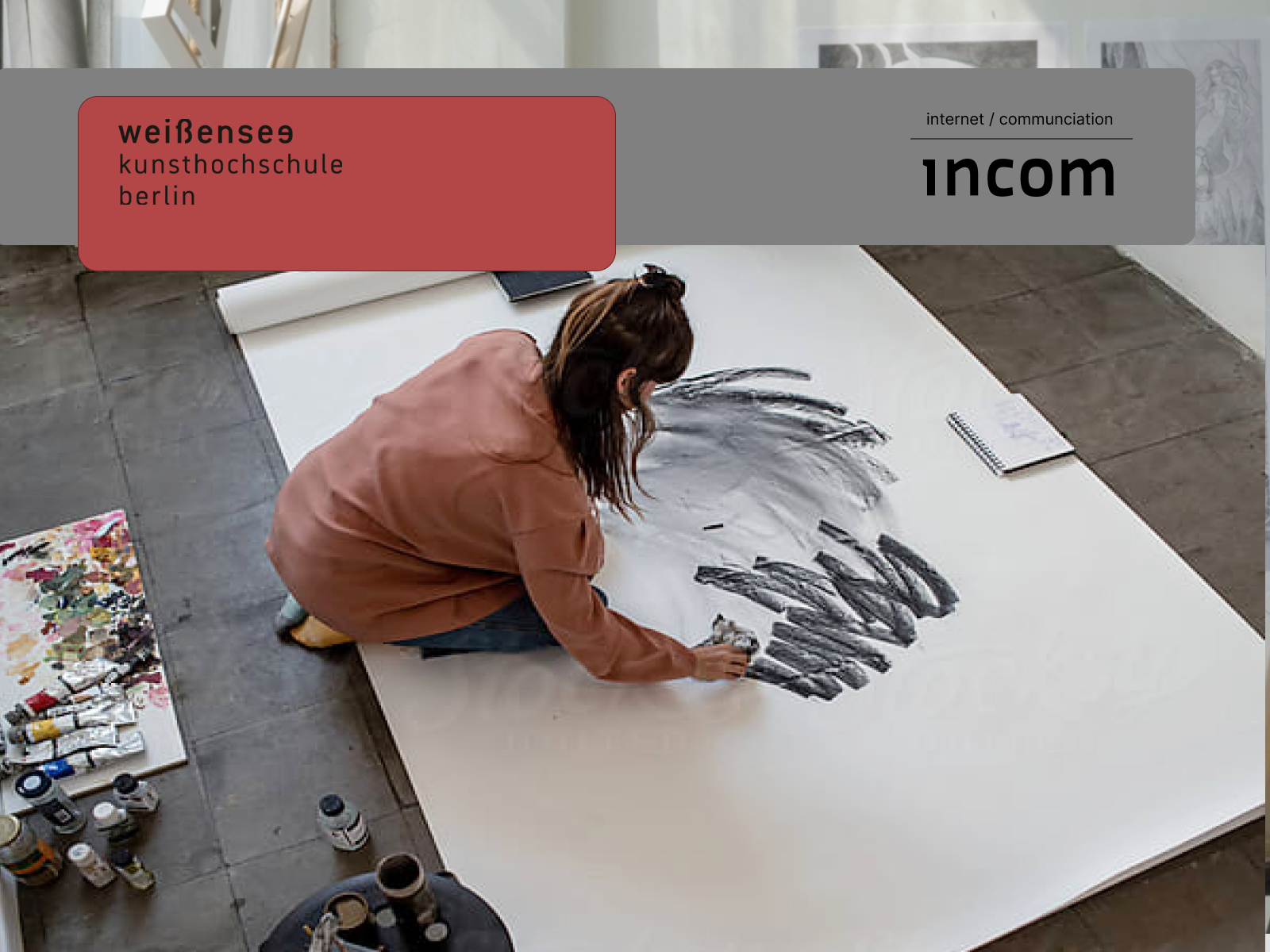
Incom enables the documentation of creative projects through a software solution
designed for art and design faculties.
Situation
- Outdated Web Design
- no Brand CI
Task
- Business Analysis
- Brand Analysis
- UX Discovery
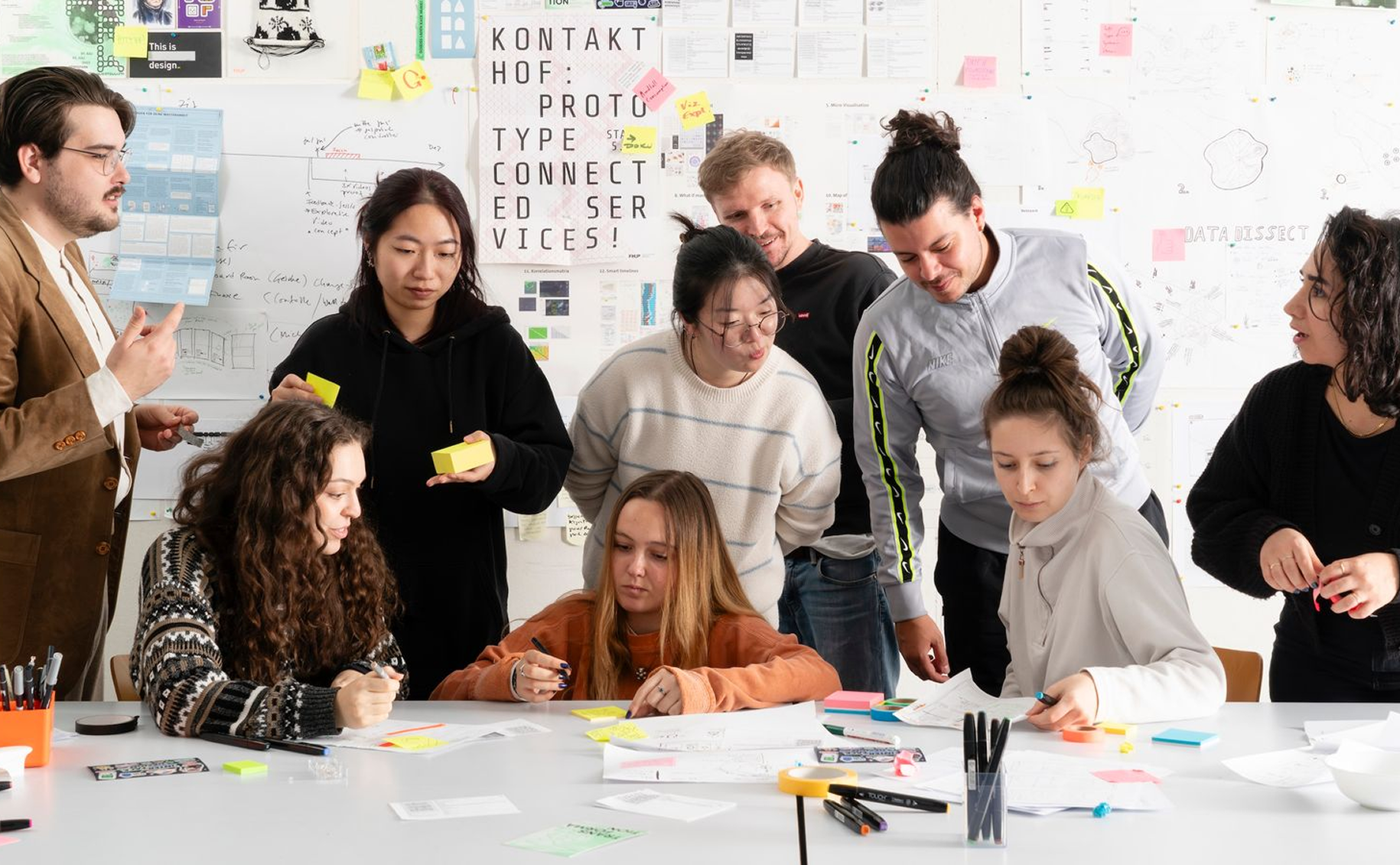
- Workshop Facilitation
Actions
- Design Brand CI
- Design Motion Teaser
- Design Website
- Design System
Results
- Brand Style Guide
- Brand Pitch
- Brand Teaser
- Brand Story
+++++++ Academic Software
Incom - designed with us and for us for academic collaboration and pee review,
- INCOM was originally developed in 2003 and has since established a strong reputation in the field of educational software. However, this positioning is not immediately recognizable for first-time users. The core value proposition — a platform specifically designed for creative universities and faculties to support peer-to-peer reviews and creative collaboration — should be communicated more clearly and prominently.
- The Landingpage and SAAS experience seems to feel disconnected. During the brand audit, it became clear that INCOM’s brand story and long-standing expertise are currently not communicated visibly enough. Developing a clear brand narrative is therefore a key factor within the rebranding process — as it gives the platform stronger meaning, emotional relevance, and a clearer strategic direction for the future.
- INCOM collaborates with universities and was designed equally for students and educators — intuitive, secure, and affordable — enabling creative collaboration without compromise. Strong narrative brand communication transforms the platform from a purely functional software solution into a meaningful ecosystem that people can relate to, trust, and remember long-term.

Brand Name - Internet Communication -

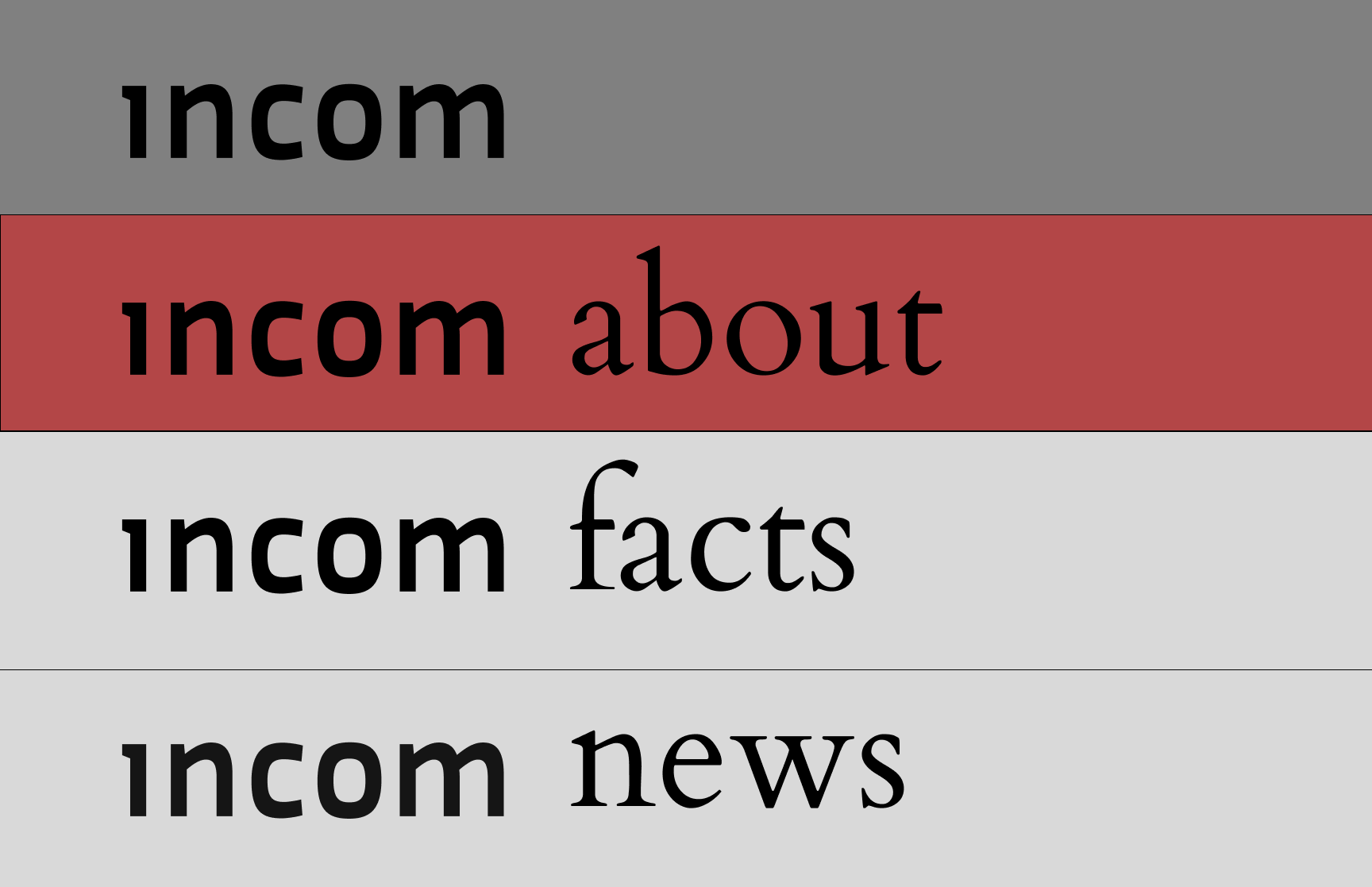
Incom Logo Font Design-

Defining the User Group
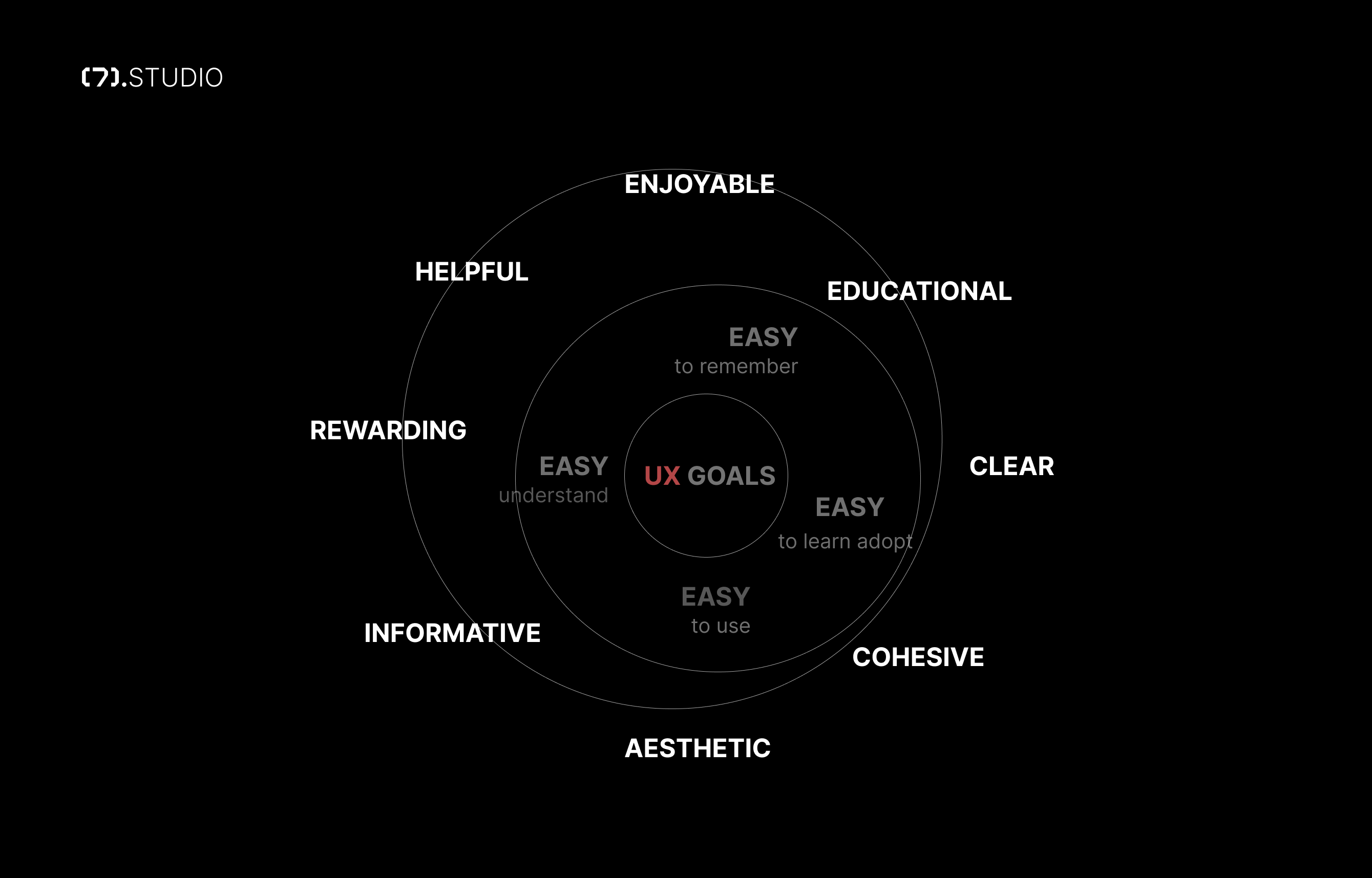
Defining User Testing UX Goals-

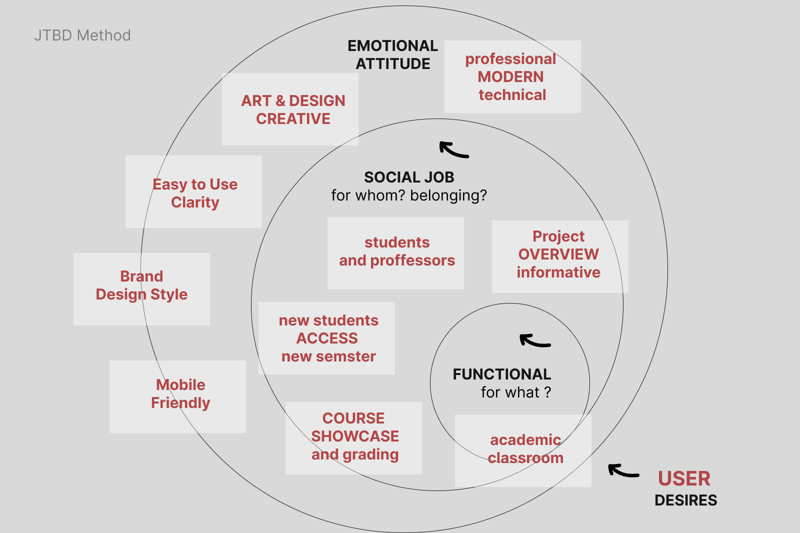
-
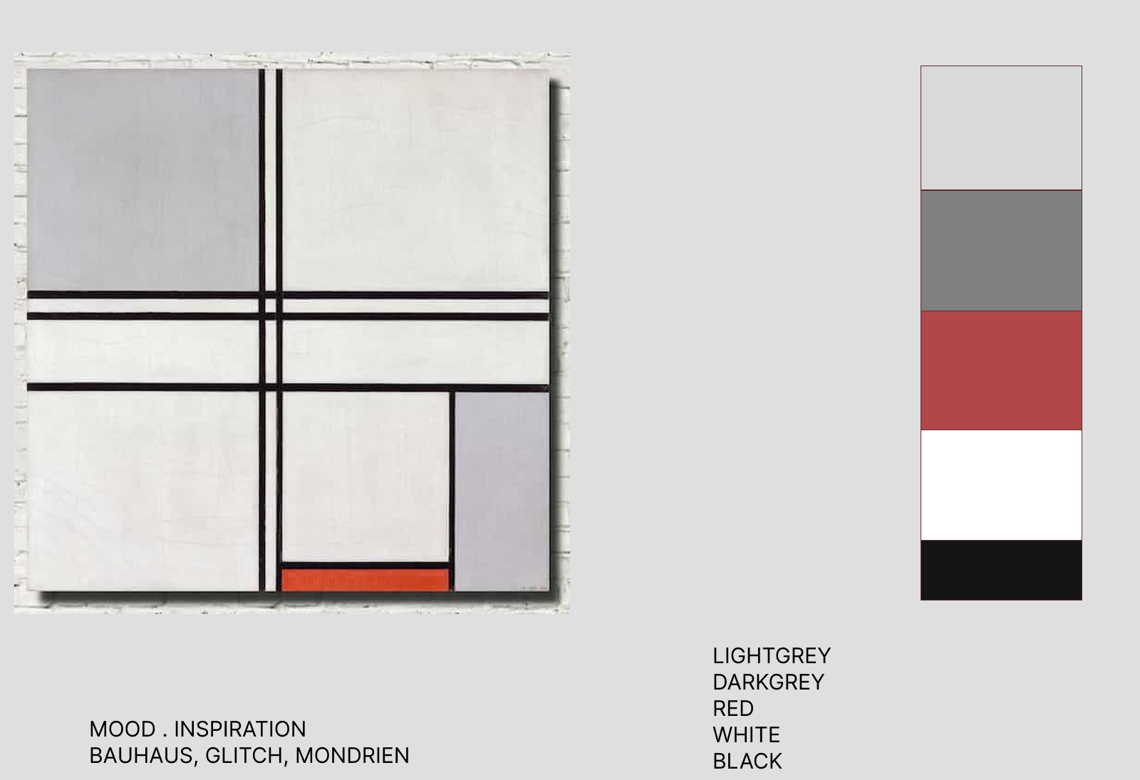
Incom Mood Visual Glitch inspiration
-
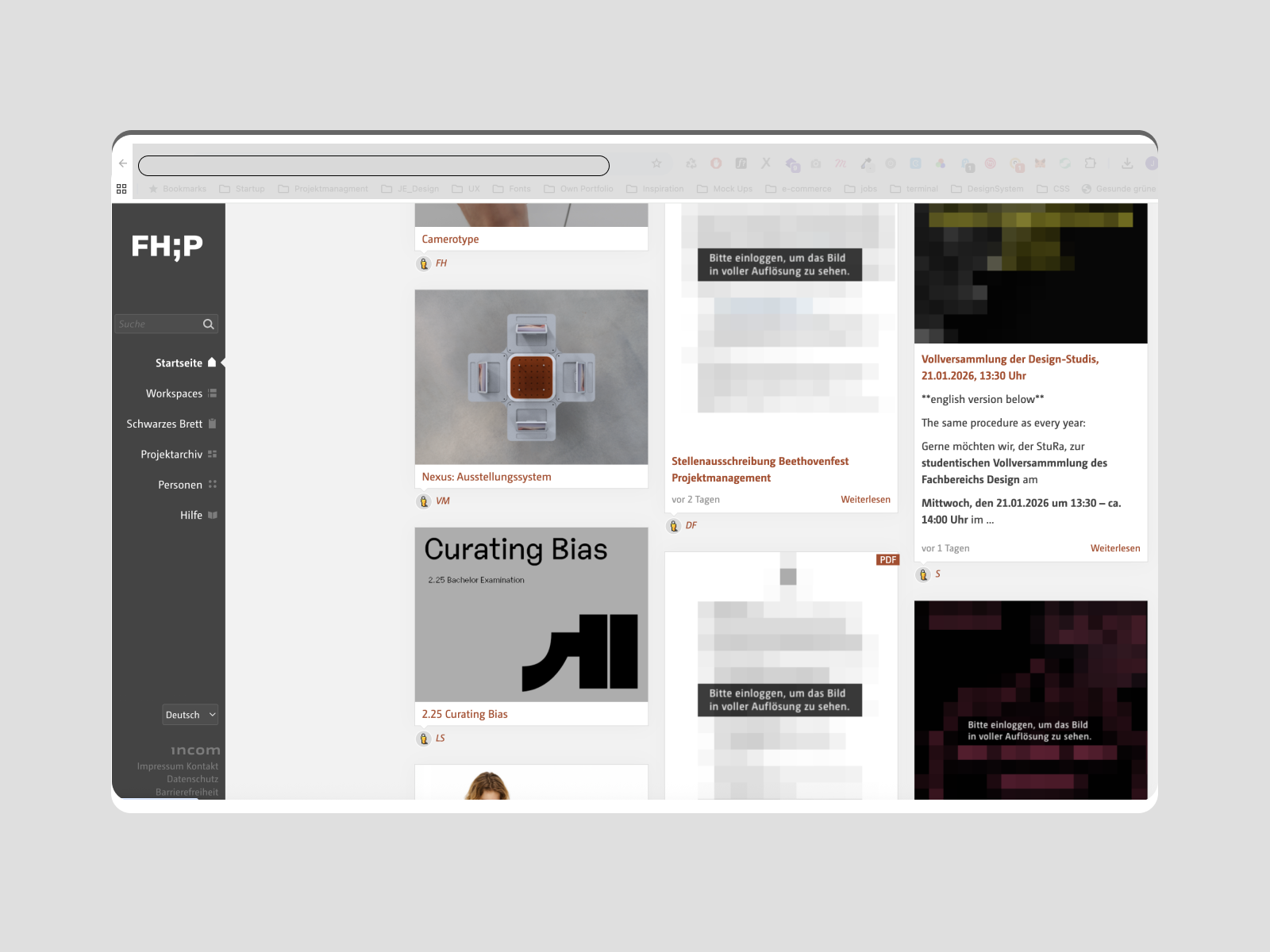
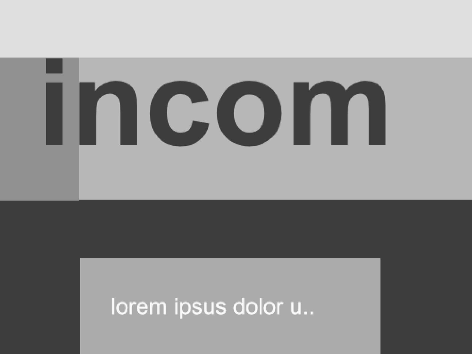
Incom Saas Web Interface
-
Incom Brand Design Inspiration.
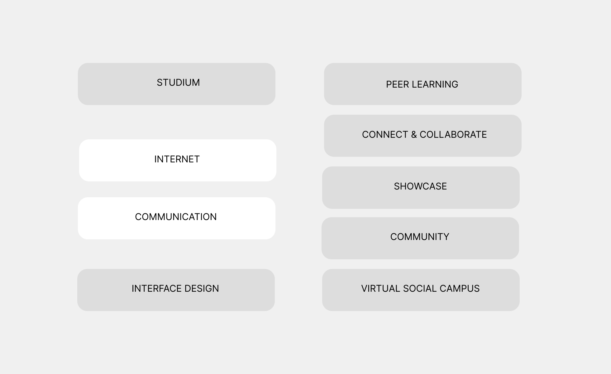
Incom Purpose/Vision
We aspire a professional, modern, functional messaging for academic education


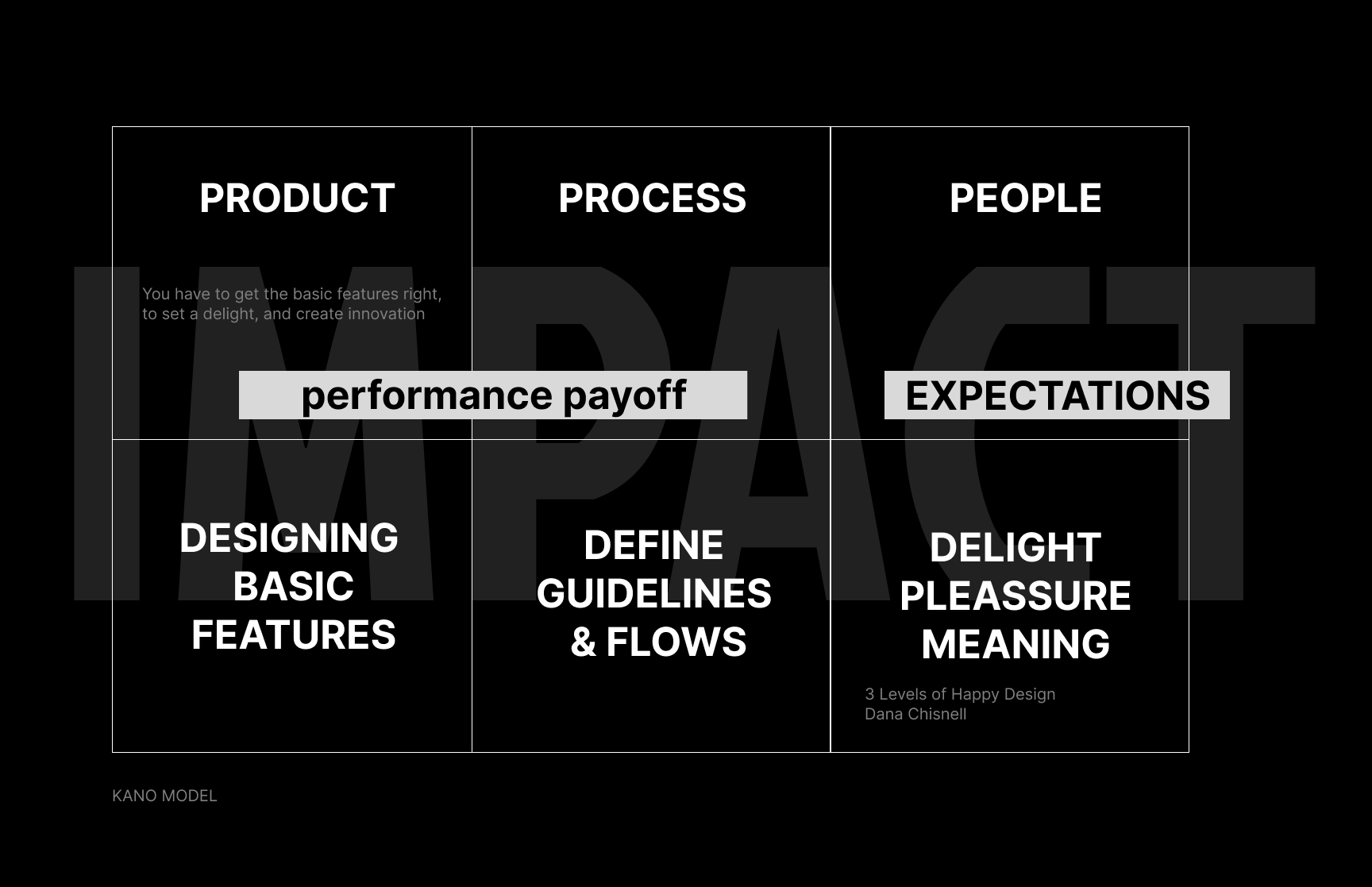
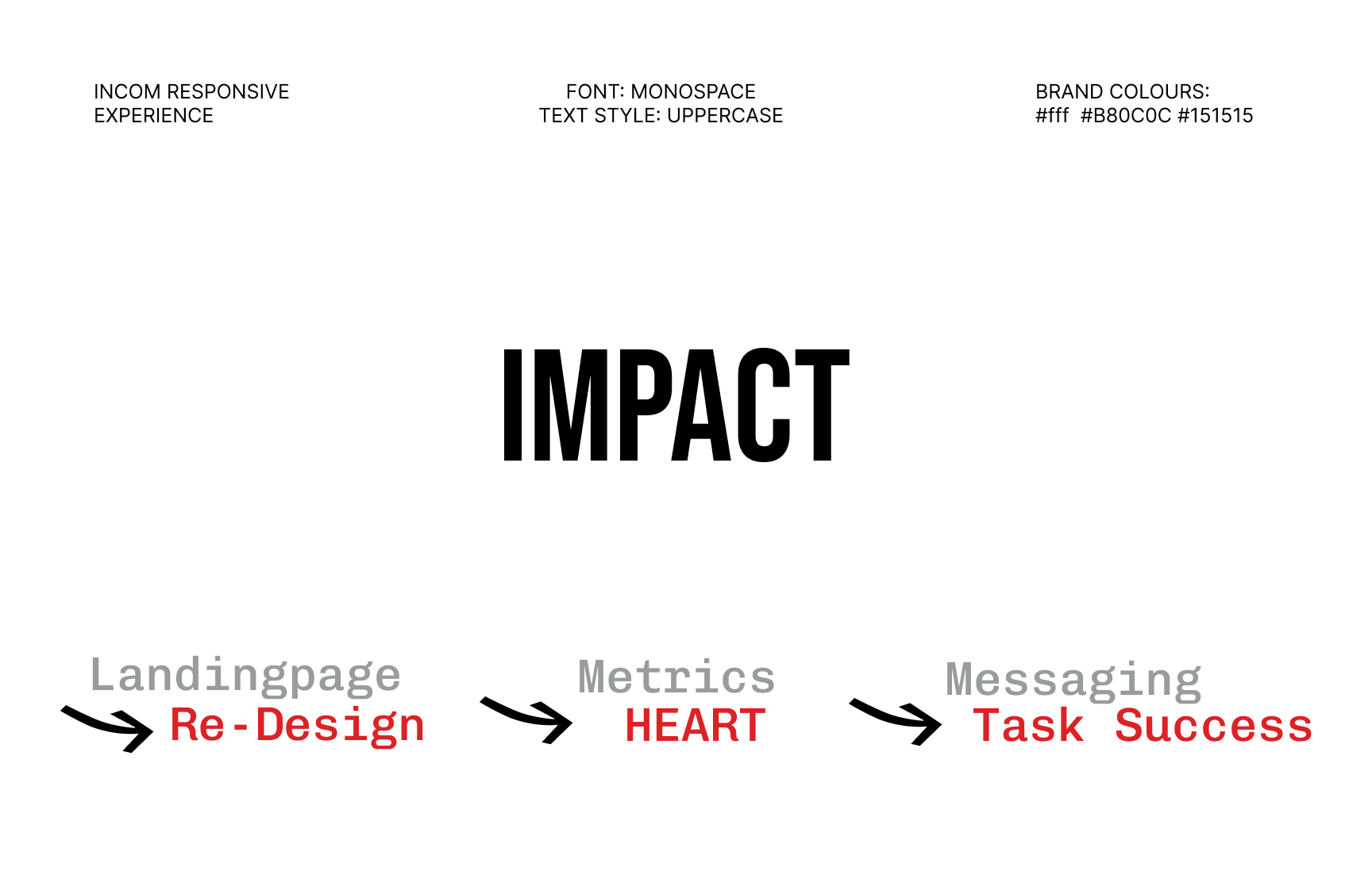
Impact Kano Model

Clarifying Purpose and Vision
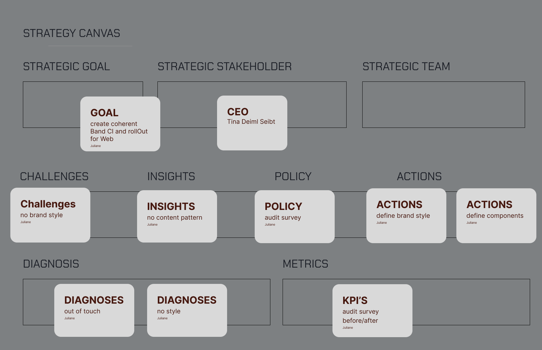
Project Strategy Canvas
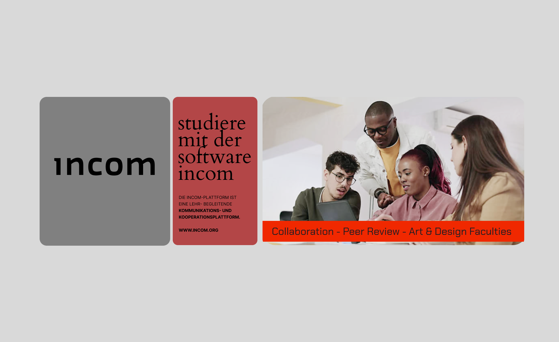
- Study with INCOM During the brand audit, it became clear that INCOM’s brand story and long-standing expertise are currently not communicated visibly enough. Developing a clear brand narrative is therefore a key factor within the rebranding process — as it gives the platform stronger meaning, emotional relevance, and a clearer strategic direction.
- INCOM was originally developed in 2003 and has since established a strong reputation in the field of educational software. However, this positioning is not immediately recognizable for first-time users. The core value proposition — a platform specifically designed for creative universities and faculties to support peer-to-peer reviews and creative collaboration — should be communicated more clearly and prominently.
- INCOM collaborates with universities and was designed equally for students and educators — intuitive, secure, and affordable — enabling creative collaboration without compromise. Strong narrative brand communication transforms the platform from a purely functional software solution into a meaningful ecosystem that people can relate to, trust, and remember long-term.

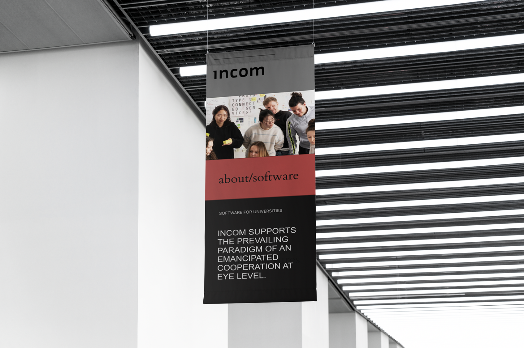
Advertisment for different Faculties

Advertisment for different Faculties
“When I complete a design or media project, I want to present my work in a clear and engaging way to peers, lecturers, or an external audience — so that my achievements are properly recognized and I can build a professional portfolio over time.”
A new Website Landingpage
should speak to the needs of professors and students.

Metrics and Outcomes
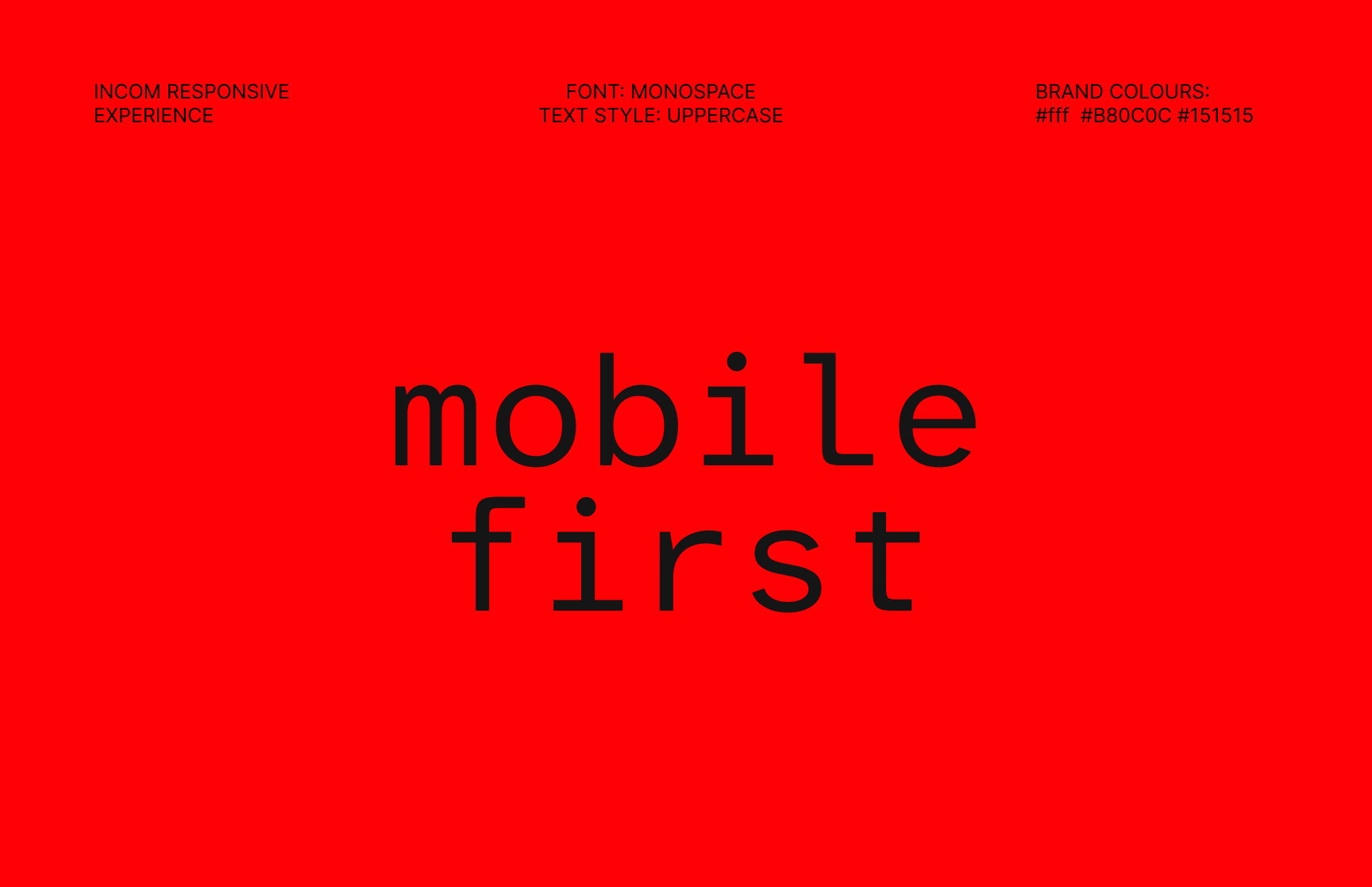
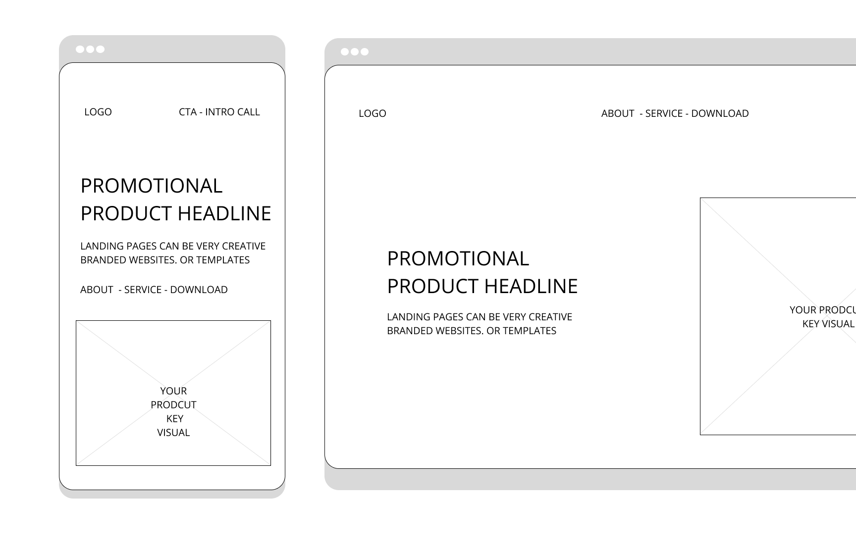
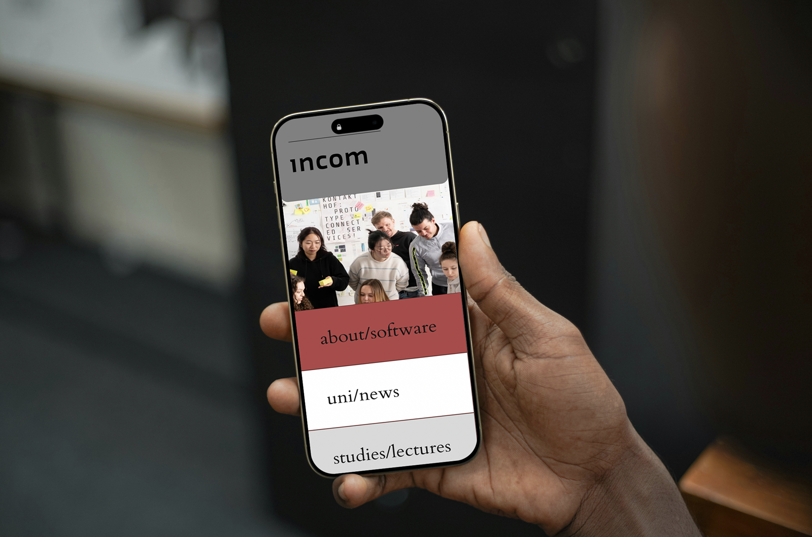
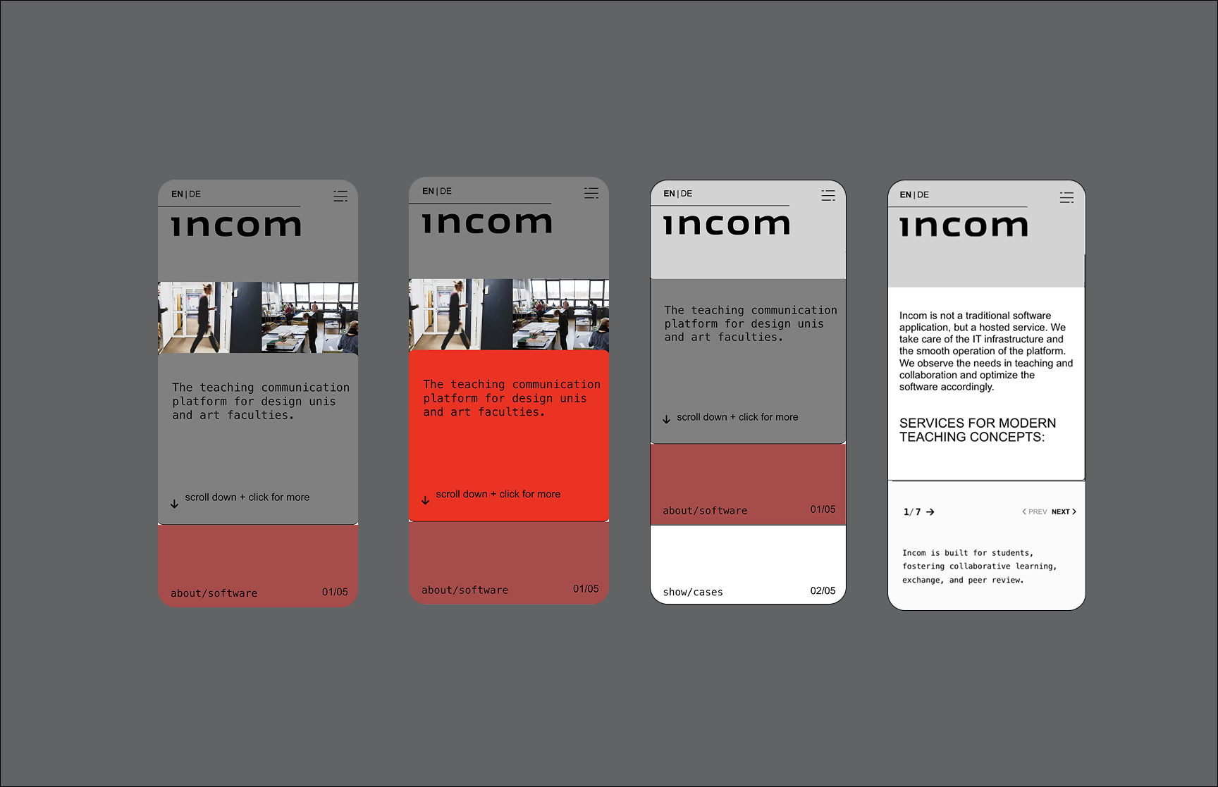
Mobile First Approach
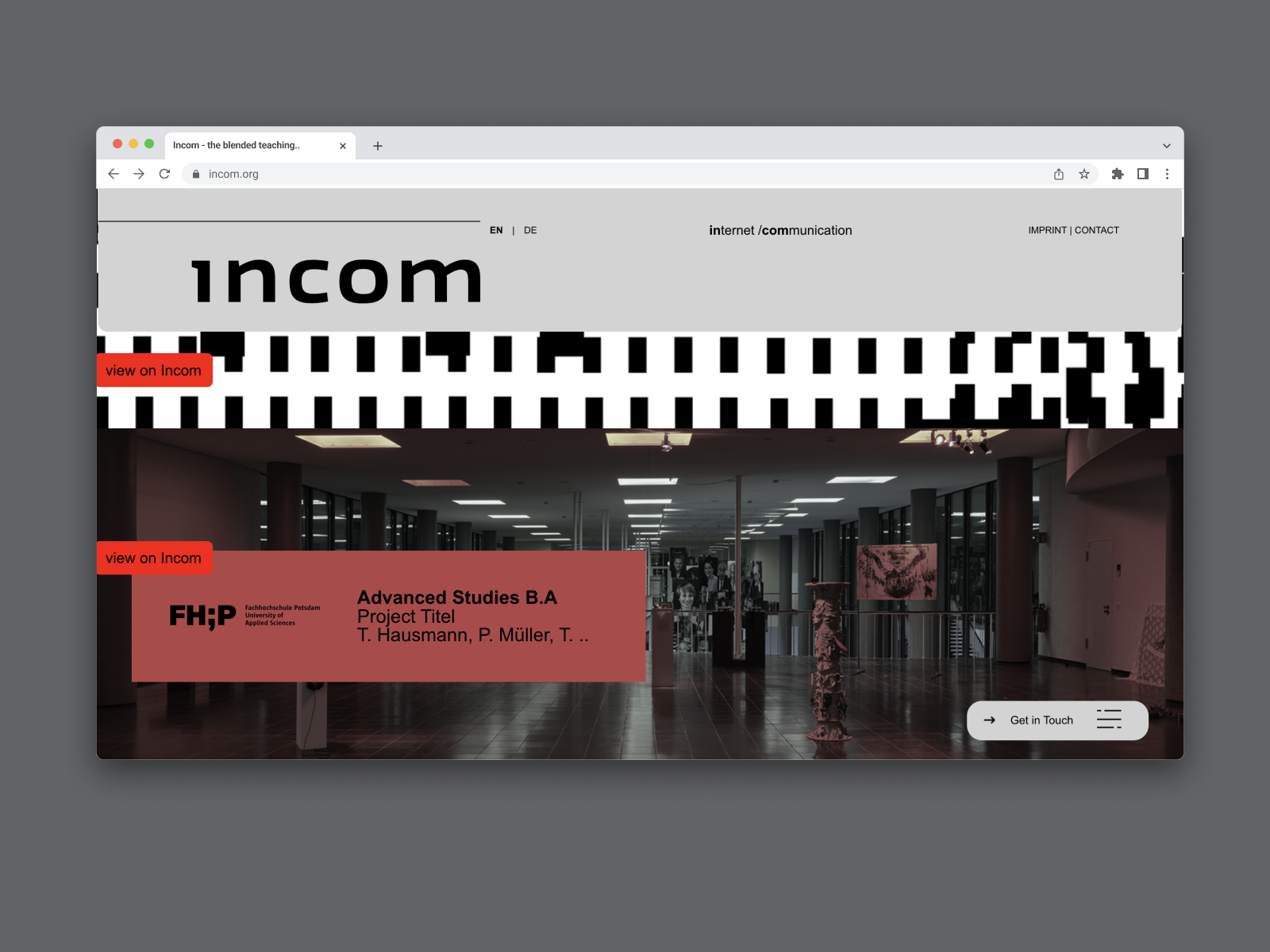
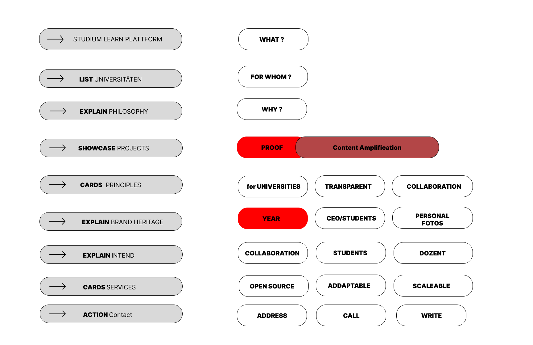
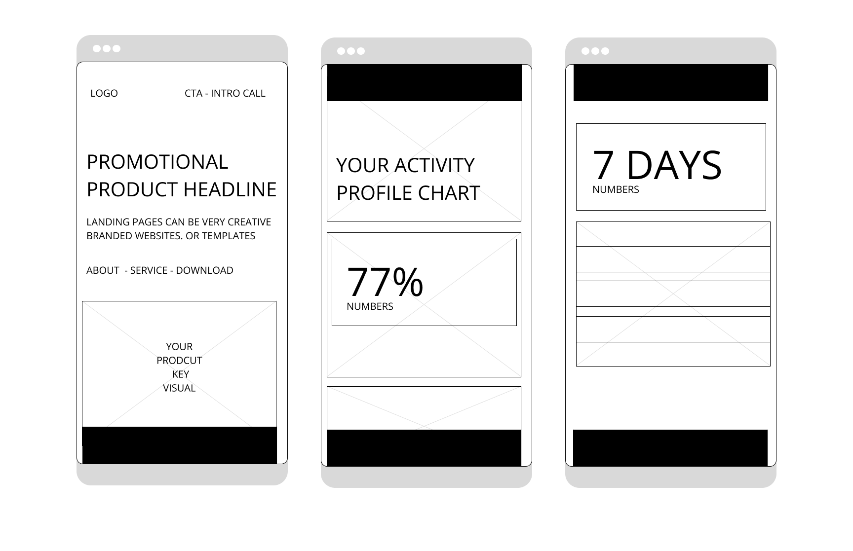
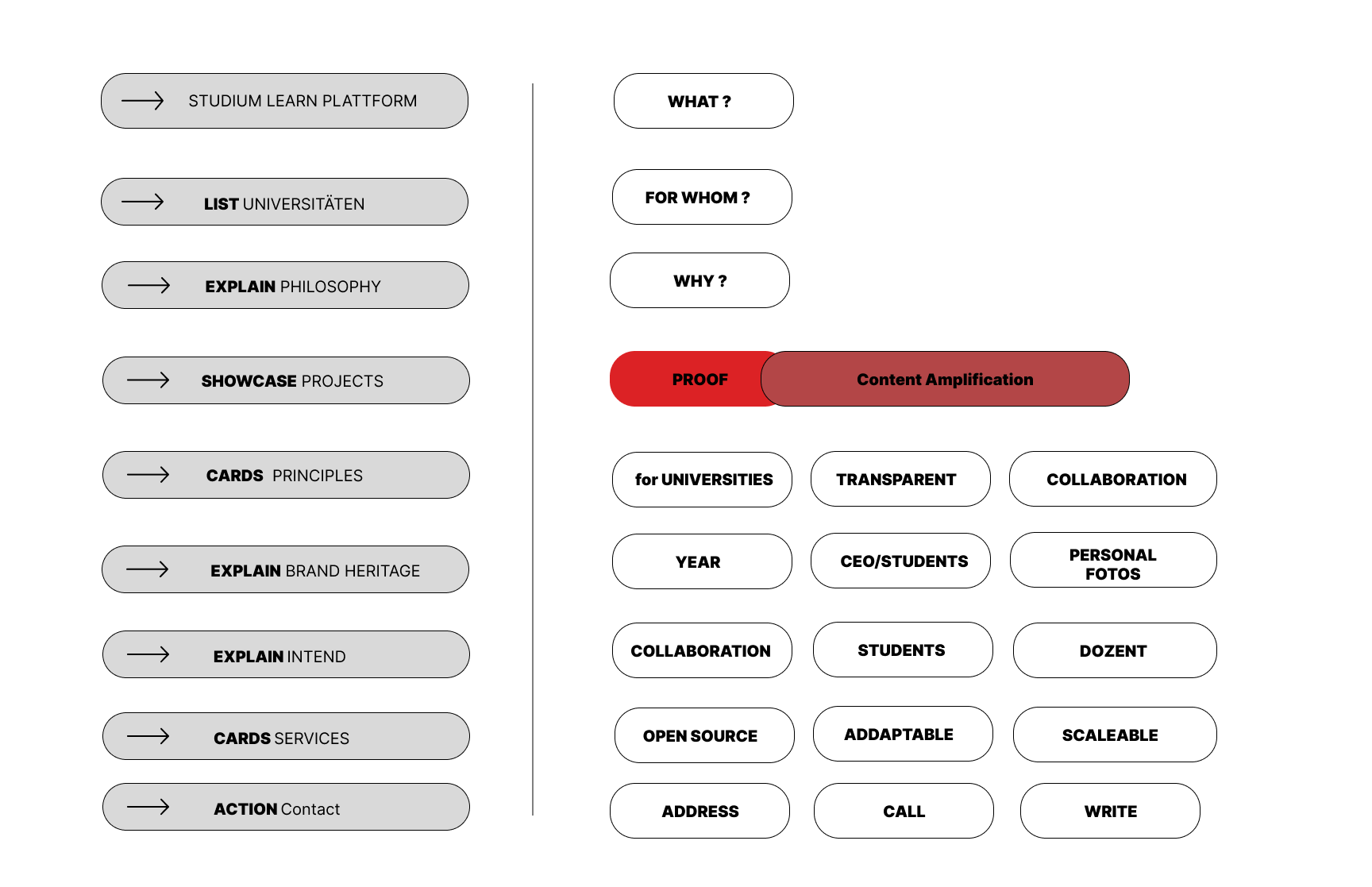
5W's Landingpage NEW Structure (Proof and Heritage)

Proposed New Accordion Layout Design

Ai Website promted Layout Draft

Old Startpage
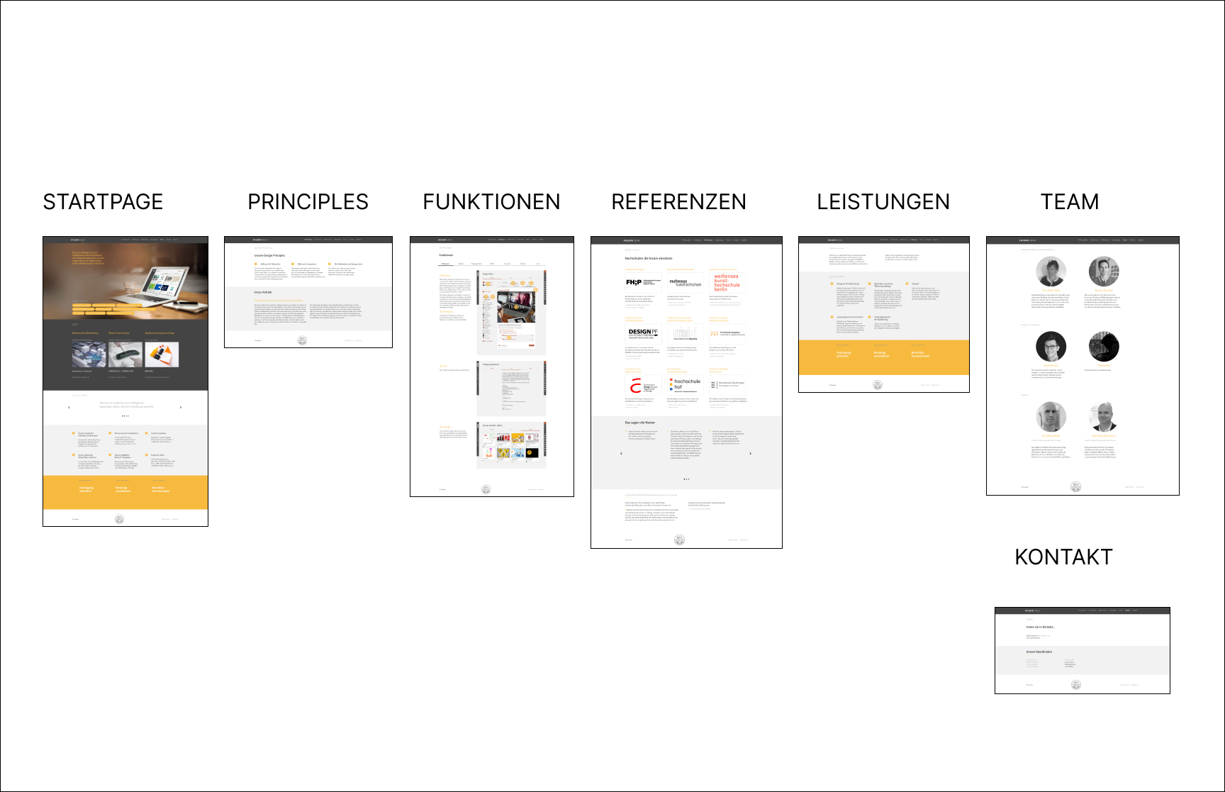
Website Screenshot Old
- Lean UX & Design Thinking helped us understand the customer journey, identify user needs, and develop a user-centered solution. Through the iterative approach of Lean UX, we explored different design solutions, gathered feedback, and continuously refined the experience to ensure the landing page effectively communicates the company’s message and value proposition.
- One-Page Website The challenge was to restructure a multi-page website into a focused one-page information experience. Layout & Navigation For this specific use case, it was important to highlight content priorities and enable easy content scanning. Visual Hierarchy Three different layout types were introduced to guide user attention and emphasize the most important information throughout the page.
- Brand Experience Throughout the collaboration, it was important to strengthen INCOM’s brand experience in order to position the platform as trustworthy, professional, and contemporary. By developing a consistent visual style, a clear brand message, and intuitive navigation, we created a positive user experience that supports a more modern and cohesive brand presence.
- UX User Goals The user goals were divided into three categories: 1. Primary Goal: Users should understand the platform and sign up for a trial version. 2. Secondary Goal: Users should recognize the platform’s benefits and build trust. 3. Tertiary Goal: Users should perceive the brand as modern, professional, and trustworthy.
-
Key Message The existing website is informative, but its communication and positioning are not immediately clear.
User Test – Task Success User testing revealed that users were not always able to find information quickly and intuitively.
User Test – Satisfaction The current website experience does not appear particularly engaging or visually appealing for its professional context. - Brand Experience The current visual identity does not yet fully reflect the software interface and overall digital experience. To create a stronger and more cohesive perception of the platform, interface design, tone of voice, and user journey should work together harmoniously — creating familiarity, clarity, and trust across all touchpoints.

ANIMATION: Header reveal

ANIMATION: Accordion Section open View

ANIMATION: on scroll reveal

Static Multipage Website
-
Website Screenshot Old
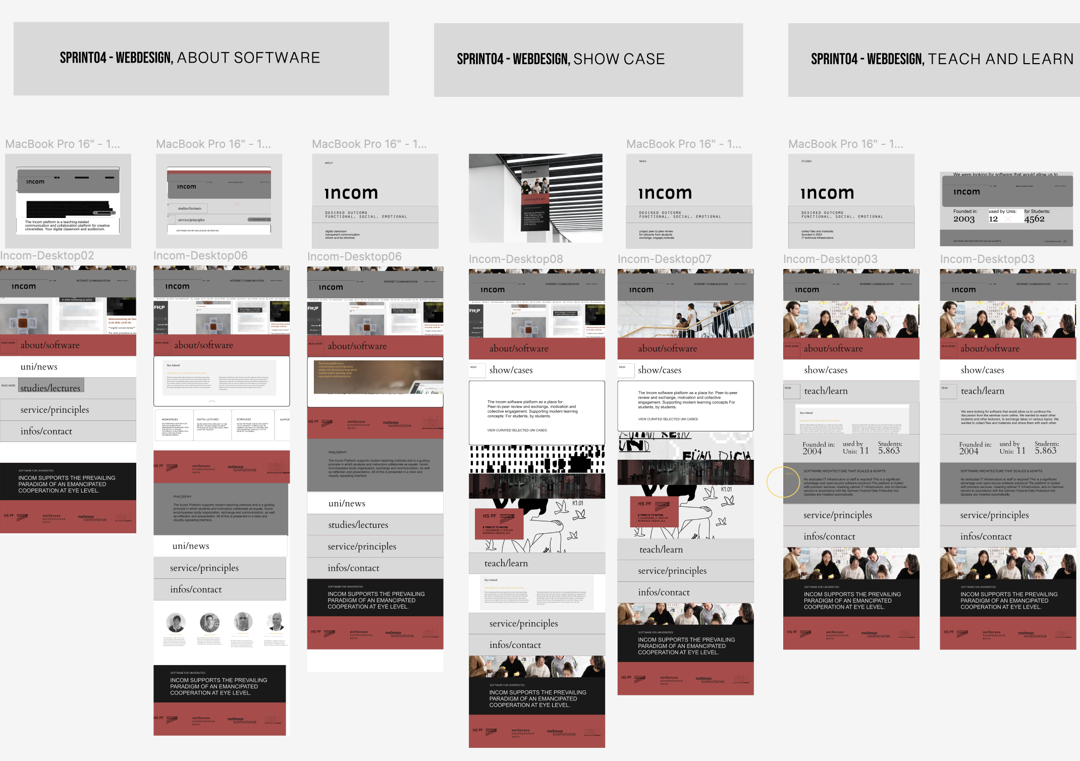
NEW Layout Overview
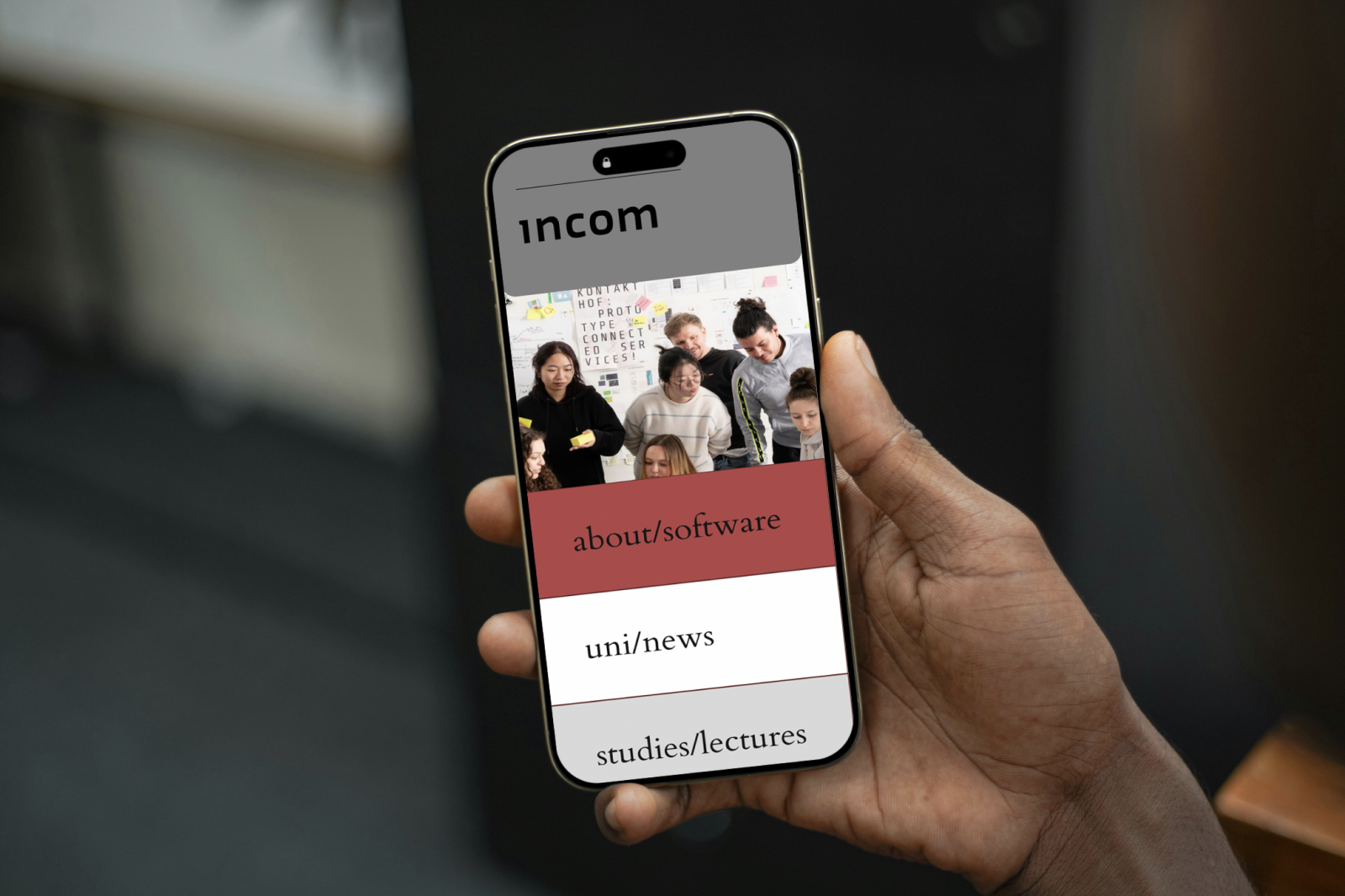
The Brand Identity should visually reflect the experiece of the current UI software ,
+++++++ Key Takeaways
-
1. Prioritize Clarity & Simplicity
Users should immediately understand what INCOM offers and how the platform works. Reduce visual clutter, establish clear navigation structures, and guide users intuitively through the experience. A minimal and focused interface improves usability and lowers the entry barrier. -
2. Build Trust Through Transparency
Clearly communicate the platform’s purpose, features, and educational value. Transparently showcase projects, institutions, and community activities. Consistent design patterns, accessible information, and a professional visual language strengthen credibility and trust. -
3. Mobile-First & Responsive Experience
The platform should function seamlessly across all devices and screen sizes. Optimize layouts, navigation, and interactions for mobile usage while maintaining a consistent desktop experience. Fast loading times and responsive behavior are essential for accessibility and engagement. -
4. User-Centered Personalization
Support users through personalized content, relevant project recommendations, and intuitive workflows. Highlight recently viewed content, followed topics, or institution-based feeds to create a more relevant and efficient experience. -
5. Strong & Cohesive Visual Identity
The visual identity should reflect the platform’s quality and creativity. Branding and interface design must work closely together to create a recognizable and consistent ecosystem. Typography, color systems, imagery, and motion design should harmonize across all touchpoints. -
6. Consistency Across All Touchpoints
Interface design, tone of voice, onboarding, and communication should function as one connected system. A cohesive brand experience creates familiarity, strengthens recognition, and increases long-term user engagement. -
7. Design for Diverse User Groups
INCOM serves students, educators, institutions, and creative professionals with different levels of experience. The redesign should support both beginners and advanced users through accessible navigation, clear interactions, and inclusive design principles.