~/ DOG BED GUIDE next case
+++++++ Product Market Re-Positioning
Reposition Brunolie products as a premium, pet-wellness brand.

- How we got our start? Brunolie GmbH was founded in 2018 with the goal of creating high-quality products for dog owners who want to give something back to their pets. The brand positions itself as more than a premium pet shop, focusing on the relationship between dogs and their owners and the idea of being a dog’s best friend.
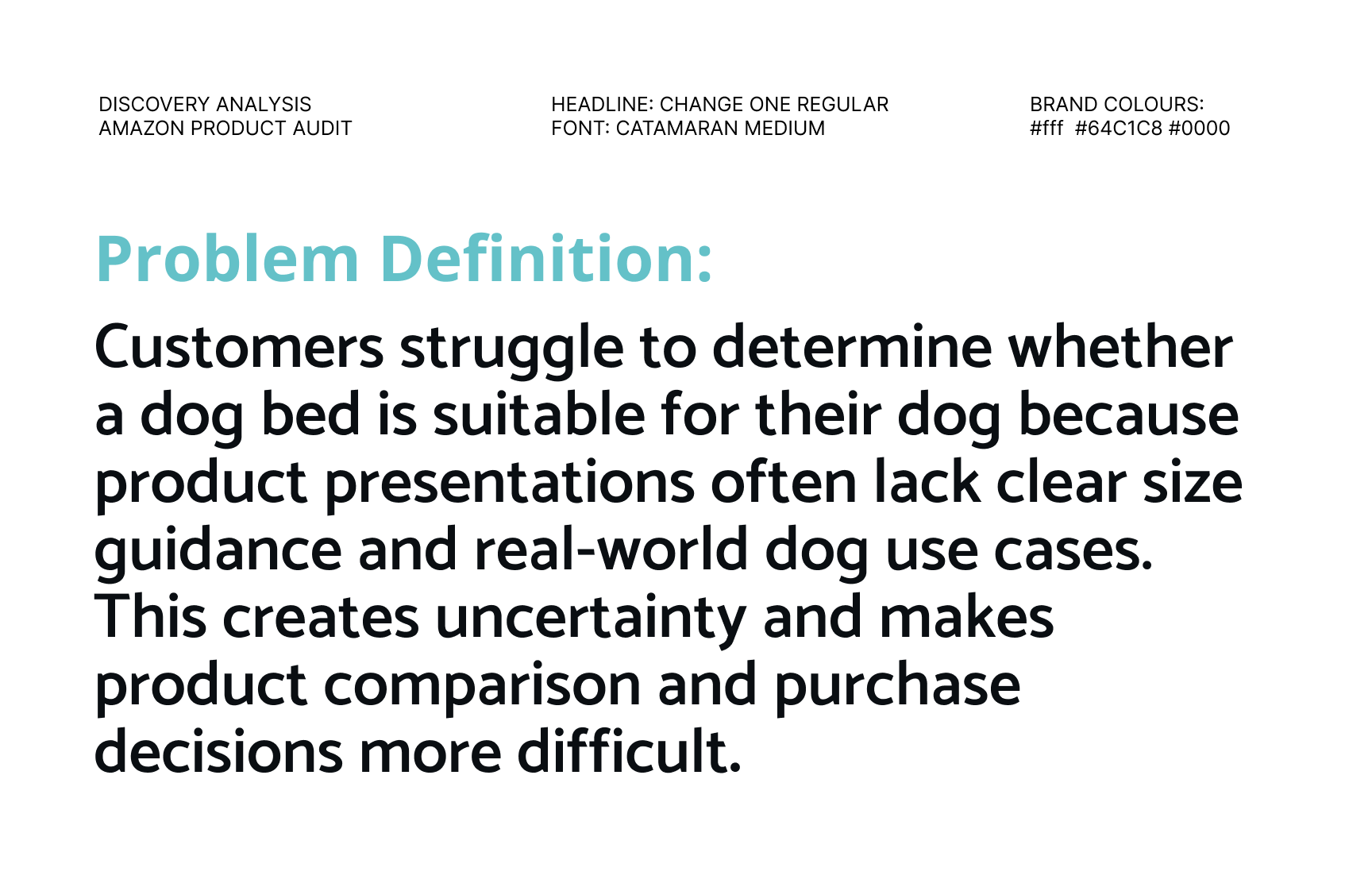
- Problem: The current product communication creates no emotional connection with dog owners, and provides limited practical guidance for the purchase decision. In particular, the presentation lacks clear size recommendations and visual use cases, making it difficult for customers to understand which dogs and everyday situations the product is suitable for.
- USP: The key differentiaton is orthopedic support and pressure relief. Brunolie positions its dog beds as designed to reduce strain on the spine and joints, helping dogs recover and relax after activity. The product also emphasizes high-quality materials and comfort, with the aim of reducing tension and supporting restorative sleep.

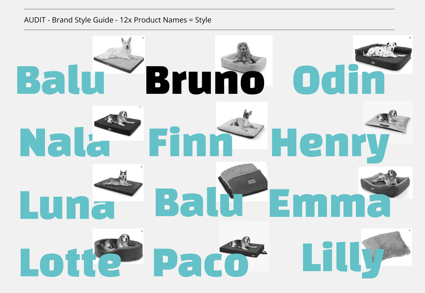
12x Products Audit Size Guide
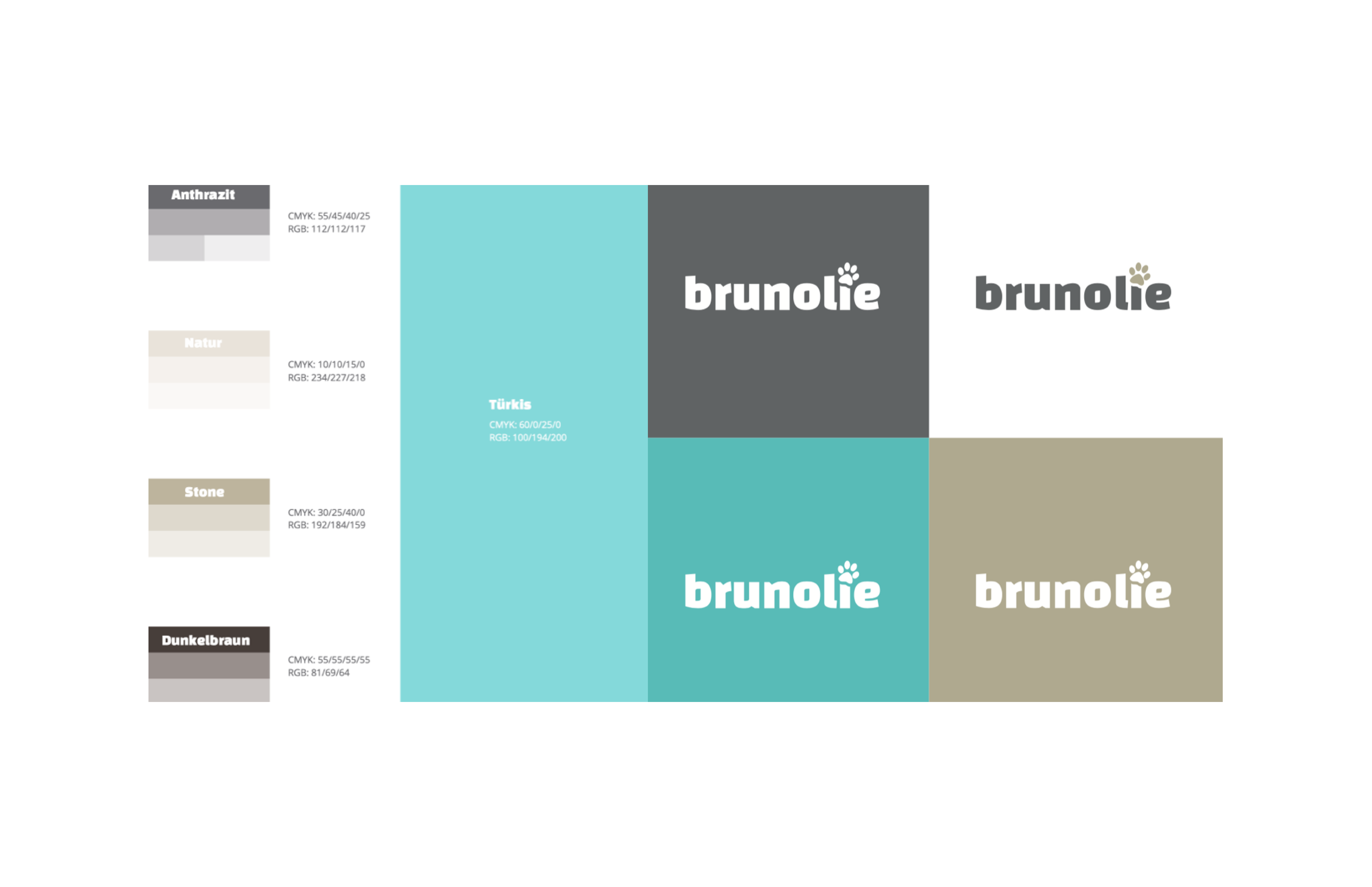
4x Colours and 5x Languages in 585x Grafic Assets


Dog matching Product Size meassurements are the Focus of the presentation


Customer Research reveals expectations about product presentation and choices.

I gathered Qualitative Data, to vote about the concept and direction.


The Concept for the Grafik deliverables is clear. Now we Explain the trait offs, ..


Exploration the Dog Size Meassurement as USP Grafik product feature


we visualise additional premium features with star ratings and icon badges


We took the extra mile to scaleability, consistency and efficiency..


Brunolie Project
Key Takeaways
- [+] Startegic project collaboration: workshop collaboration with internal Product team defining the Project KPI'S and UX research strategy, including regular feedback sessions and data-driven insights, helped align and validate concept adjustments throughout the project.
-
1. Translating an Abstract Concept into Tangible UX:
Successfully transformed a complex, value-driven investment philosophy (Sinnvestieren) into a clear, engaging, and easy-to-navigate service page that users could understand and act on. -
2. Strong User Engagement Through Purpose-Driven Design:
Achieved a 68% increase in average time on page and 64% scroll-depth engagement, indicating a high level of user interest and interaction with the content. -
3. Conversion-Centred Content Architecture:
Improved click-through rates to sustainable product pages by 39%, showing that the new content structure and calls to action effectively guided users towards conversion. -
4. Mobile-First Optimisation That Delivered Results:
Boosted mobile micro-conversions by 43%, reflecting successful responsive design, simplified user flows, and more effective on-the-go engagement. -
5. Human-Centred Storytelling Enhanced Trust and Accessibility:
Used illustrations, relatable language, and modular storytelling to make financial topics more emotionally resonant and accessible, while achieving a 98/100 accessibility score. -
6. Positioning Deka as a Thought Leader in Sustainable Finance:
Created a distinctive digital experience that communicated Deka’s sustainable investment approach in an accessible and credible way, strengthening its positioning within the sustainable finance space. -
7. Built a Scalable and Testable Design System:
Developed modular UI patterns and reusable components that supported consistency across the experience while enabling future iterations, testing, and content expansion.